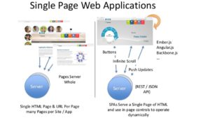
Single page Applications are becoming very popular which is a fascinating trend.
Most people are spending more time online, and they don’t want to waste the little time they have. They’ve got things they want to be doing more than sifting through pages on your site to get the information they need. If somebody’s taken the time to go to your site, they want the information they’re looking for NOW. If they don’t find the content they need straight away they will simply leave.
Also, Advances in technology make it possible to push this trend further. The overall change in style of web development that has been happening for the last 10 years or so. The “Web 2.0” style of design is to remove as much clutter from the page as possible.
Single page websites give us many benefits.
Your users will surely have a good work experience if you have a single page website because there will be no much pages to navigate. Websites that are difficult to navigate and not mobile responsive are a big problem in the web development industry.
Single page designs create a uniformity across platforms where users are already used to scrolling content, interactive elements and intuitive navigation. This can be accomplished by utilizing a design concept we call Responsive +. This will not only ensure that your design adjusts in size to any device but that it feels right when viewed on any device.
One issue with websites that have a lot going on is that they are often hard to use. Whether it be because the page is cluttered or there are too many links to click, these websites are hard to digest. The main advantage of single page websites is easy navigation. Since there is only one page, your users will not get lost so you don’t need to worry about the navigation. Most probably you won’t need a navigation bar or if you want you can keep one navigation bar. One page websites make it easy for every user young and old. With minimal effort, users can scroll up and down without worrying about multiple pages.
Every good website should be operable on mobile devices as well as desktop computers. One page websites provide a beautiful look to the website on every device They will have an easy access to the information and they will not have any problem on how they can get into a relevant topic of your site. Your users will surely have a great, eye-pleasing (on every device) browsing time.
The main focus of Single Page Websites is that it focuses on quality and not quantity. You can simply focus on your website without thinking about the other pages of the site. You will have a better website with good quality and better results.
Since there is only single page, there are more chances for increased Google ranking. This means that the ranking will be applied to the whole site because there is a single page which can lead to higher traffic.
Bounce rates tend to be lower on single page sites. This is because there’s very little to do or become confused about. It’s just the visitor, a good story and the primary objective for which that site was designed for. If the site’s story and flow are effective, the bounce rates are going to reflect that reality by enticing visitors to hang out longer. Single page designs offer a unique way to organically propel visitors (and those they share your site with) into an effective sales funnel they actually enjoy.
Lastly earlier it was quiet an endeavor for both businesses and individuals to create beautiful, custom websites. Not just thousands of dollars, but tens of thousands of dollars. With a Single page website that’s no longer the case.


