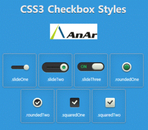
CSS3 check box styles – Cascading Style Sheets, or as developers commonly refer to it, CSS is a design language that offers developers a simpler means to develop beautiful and elegant web page elements. The layout of the web page elements are handled using CSS code blocks. Right from the colour of the text, to the layout of the columns and text within them, including font style and sizes, spacing options, background images, everything can be managed through CSS. One of the most important elements of CSS is the check box. Every web page has one checkbox at least. Layout of the checkbox, size and its appearance on different devices is of key importance to the aesthetic of the resultant application of the code. This article discusses how one has to approach checkbox styles in the latest version of CSS, CSS3.
Understanding the Process
In CSS3, you can target elements buy using commands that particularly highlight them. In the first step, an input of a checkbox type is given. Now, we target it by checking for its status. This is done using the CSS3 exclusive “:checked” or “:unchecked” pseudo selector. Adding the + adjacent sibling selector enables access of the input with an element, in our case, a label. Whenever the label is called for, the checkbox input is activated.
Setting up HTML
Once a checkbox is created and assigned a label, create HTML and CSS files for getting the code to work as the next step.
The label element created previously enables you to interact with the input (checkbox) through the label.
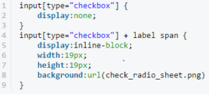
First step is to hide the checkbox. You would want your label to feature and not your checkbox, hiding the checkbox is done using simple lines of code.

This command hides the checkbox.
The next step involves calling the label function and adding the preferences. Styling of the label, positioning, size and shape, background images etc are possible through lines of code. Text in the content is another in-check belong added input label, but more specifically the span inside of the label. I do it this way in order to give myself more control over the exact position of the check box. Without Positioning, the label is also possible. Upon addition of specific details, the aesthetics of the label are changed.
To make this work
Once done, all you need to do is provide a state for an element when the input is checked for its status, you can also offer a hover option for the labels.


